Monday, 30 November 2015

OUGD504 Brief 4 - Ideas (HOMEPAGE) - The starting point

After drawing out some ideas I thought it would be best to digitalise
these to give a sense of life and also to see if they work as many times
I have come up with an idea and it has not come out he way I expected.
This also makes sense due to it being a digital brief.

My ideas have a constant theme of reveal which I have explained in other
posts - After looking and assessing my designs many are over complicated
and cluttered I want the site to appear clean, open and friendly to appear
to a wide audience of all backgrounds and ages to do this my design needs
to be simple and uncomplicated but also have something to keep the audience
engaged thoroughly. If I keep my design clean I am more likely to find my
design fits and compliments the briefs target audience 'fans and non fans'
hopefully reaching out to a new and wider audience.


OUGD504 Brief 4 - Kim Bottomly user experience

How to identify your target market/audience?

Kim went into detail on how to approach creating the best and
most appropriate user experience for the consumer, she explained
that to start such a project you will need a big helping of market
research which is not always availble for students, Kim showed us
a simple and easy task which helped us identify our target audience/
market for brief 4 in a way that only takes 5 mins and is free as most
market research involves big money and big time. If working for a
client with a budget it is recommended you use a big chunk on market
research as this is the most important part of the design - your design
could be awesome but if its not for the right person its not going to
have much effect.

Character Profiles

To start we individually spilt a page into 4 sections :

1. Name & Sketch
this is were you draw your target audience who you want to aim your
design at

2. Demographic
A small insight to the actual person so how old are they?
Gender? Status? Family arrangement? Are they a student?
do they have a job? what job? and where are they from?

3. Their behaviour
Their daily routine basically so for example. Gets up has cereal
listens to music on iPod, walks to work...

4. Needs and goals
What do they want from you, your design or what do they want in
life. e.g. To buy and enjoy their album? Receive a product?
Access to updates on the new album release etc.


Sunday, 29 November 2015

OUGD504 Learning to use Colour Management/Cleaning a Machine (Kolorcraft)

Cleaning the Durst P10

At work this week I am doing training to learn how to use a 
printer this weekend I learnt how to clean the printing heads
for a Durst P10 this printer has approx 24 heads it prints in
4 colours. It is possible to print more than 4 such as Light, 
Cyan and Magenta and also white.
A head consists of 4 shoots this is where the ink is printed from
the ink is pushed through the shoots to create the tiniest of 
bubbles of which is then suspended in air - in order for
this to work the ink must be heated (In the reservoir) otherwise
it won't print. At the wrong temperature the ink can be either
too thin or too thick producing bad prints. If the machine has been
stood not in production for a long time it is necessary to do what
they call a 'purge' this reheats the ink to optimum temprature and 
releases the ink in the 4 shoots into a waste bucket located under
the machine when you've done this you have to open up the
machine to allow access to the heads you must then wipe the 
head clean with a special cloth removing the ink as best of possible 
sometimes the ink can be very dry and will need a chemical to
remove it. Once done the machine can be tested to print my first
test came out very wavy which suggested the machine needed a
further clean, in order to print quality the lines must be as straight
as possible this can sometimes be corrected by printing a dummy 
image and then re trying the test they keep the tests at work to 
keep the machine in warranty.

The Durst P10 is relatively small but for example if the same
testing process was done on a much larger printer the test sheet
can be over a metre long - the test sheet is an image of all the
heads in the image shown there is more than 3x the amount
of heads on the 'Inca'


Colour Management

Basically when we as designers want to use a pantone colour
each printer will recognise the pantone colour and create a 
4 colour separation with a percentage of colour, your artwork will
be sent through a colour management programme such as a GMG 
which is a series of settings so the printer can print the pantone colour
with correct settings usually created by the printer. Every printer
uses different inks so this can pose a problem when creating consistency
this is why Panotone books are necessary in a printers, this weekend
I corrected around 20 pantone colours to print exactly the same as
the pantone colour it says (On different machines). To do this you 
must painstakingly print many copies and adjust the percentages until 
perfect otherwise all machines will print a different version of the colour 
you then cannot guarantee consistency which is important for campaigns. 
Although some colours will be set up in one machine they may not be in
others it can take hours and even days to correct colours - The colours
I corrected were for a waitress campaign this took me 4 hours and still
3 colours still need to be amended. 

For example if the colour is too light compared to the pantone swatch you
could add a percentage of black? you must always remember how much
you add the calculation as there is a chance you will need to reset it back 
to the colour, although the machine I was using was for colours some 
have way more which can complicate the colour management further.


OUGD504 Brief 4 - Ideas & Wireframes


I have variation of ideas as seen most of my ideas have a consistent
theme of reveal an almost party celebration of change. Because I
found this the easiest and clearest to design for I have based my
design on the concept of reveal this will help me narrow down my idea
to one or even combine a number of options. By having a clear
direction my design will be stronger and follow a theme which
should be recognisable.

Digital Navigation Wireframes (Movement)


To consider how my designs will appear on screen formats I have created
4 wireframes of a similar layout of how my designs could be navigated 
such as left to right - I believe the simplest layout will be the most successful
layout I will use these guidelines to design my ideas into.


OUGD504 Brief 4 - Concept ?

Concept


I want everything that I do to represent the band to do this I listened
and assessed current/old music alongside themes for music videos
to create a small character base. My key words from the mind map
were:


  • Fun
  • Adventure
  • Love
  • Animals
  • Passion
  • Progression
  • Personality


Because my band is changing and in effect growing I want to
be able to show this through the interactive website my concept
is to slowly reveal the bands new identity but by doing so not putting
under a negative light but rather a much more positive one by possibly
using tag lines and quotes from their current site. By showing the
band is changing fans will become intrigued to find out more by
making this experience daily users are likely to come back and find out
more hopefully leading to an indirect sale because of curiosity.


To engage with my audience I felt I needed to make my promotional
site almost constant for at least 14 days to encourage excitement in
my audience. I created a list of what I could do on the 14 days although
not permanent or in the correct order this will engage the audience to
continue using the site and feel involved, I also had an idea to create a
jigsaws puzzle which could be used every day hidden on the site so users
are forced to look for clues and pieces although in this example I have
used a jigsaw piece this could be a different puzzle -  I used this as an
example because there is a possibility of revealing the bands new identity 
right at the end in the form of the new album artwork.


Thursday, 26 November 2015

OUGD504 Brief 4 - Research

Popular Phone Apps

Netflix 

This popular app is available for almost every screen size such
as tablet, laptop, desktop and of course tv and quite obviously 
phone. The design is minimal bright and very easy to use to make
my design flow as well I should make my app very easy to use and
uncluttered.


iTunes

iTunes is an app for downloading music, videos and movies to your
phone/tablet/laptop etc. this app is interchangeable for different devices
to reach different people as many people have access to different types
of technology why not cater for all.


Be at One

Cocktail bar app this application is to interact with the bars audience
giving things such as freebies and offers in december the app usually
has a appvent calendar which a different offer is released for the 12
days of christmas by doing this it engages the consumers and also
encourages them to purchase products and spend this is a clever way
of interacting with your audience.


OUGD504 Brief 4 - Considerations Research

Screen Sizes

To design a website it must fit onto the consumers screen but to do this
you must choose the most popular and appropriate size as it is 2015 there
are many screen sizes to find out the most regularly used size I used google
it is important that I design for the most popular size screen as if not it is
unlikely users will be able to use my site. Here is what I found:


Phone screen sizes

As mobile phone is becoming wildly more popular it only makes sense
to look at design for mobile this could be were the most customers are
enticed by having the website/application available in the likes of iTunes
accessible all over the world.

After searching the most recent dates I could find as of 2011 the most 
widely used screen size for phones is 800x400 this is most likely to 
have changed since then so for this brief I will be designing for my phone
iPhone 5s this means I can send images of my design onto my phone
to see how my design appears at the correct sizes.


Wednesday, 25 November 2015

OUGD504 Brief 4 - Research

Interactive Websites

To try and find inspiration and ways of how I can make
my ideas/web experience for my users I looked at how
I interact with websites I used an award website to find
particularly good user experience sites here are a few
videos of my using some of the sites.

http://admirhadzic.com

This site is a portfolio it isn't majorly very interactive but subtle
enough that this engages the user rather than just a plain site which has
no interaction when hovering over the main images the image
dances with the mouse making me and other users engage.

The site was quick to load and fairly easy to use although some
of the pages were hard to get around. By making the images
move with mouse interaction it engages users. This would be
something easy and simple which I could apply to my design.

My rating:

Usability: 5.8/10
Design: 7/10
Creativity: 6/10
Content: 6.5/10

I chose this score based on my findings on the use of the website.


https://spotify-foundthemfirst.com

"This Spotify experiment uses listener data to reveal how many 
of today's top artists you got to early."

This site is promoting music from spotify similar to the requirements
of promoting my chosen band this site has 2 short animations on
screen phasing in and out of the musicians the site hasn't a lot on
it other than the main animations it also has links to the relevant
data such as spotify, and also the option to buy premium.

This site loaded quickly and was fairly easy to use although it was
not apparent of the purpose straight away - although the site is
interactive there could be more information about the purpose
of the site.


My rating:

Usability: 6/10
Design: 6/10
Creativity: 6.2/10
Content: 5/10

I chose this score based on my findings on the use of the website.


http://visualizer.halowaypoint.com

This website is my favourite so far, the design is incredible and
extremely interactive. This sit is to promote the new game Halo 5
the main page is of the ever famous Halo helmet there is the
option to type a comment which is then uploaded to the helmet
this how the helmet is built up. By hovering you can interact
with other users comments. As you can see from this video
it loaded very quickly and was easy to use.

"Coinciding with Halo 5's live action trailer launches, social 
commentary and UGC were visualized using WebGL particles in 
the shape of iconic character helmets."

My rating:

Usability: 9/10
Design: 10/10
Creativity: 9/10
Content: 8/10

I chose this score based on my findings on the use of the website.


http://www.orchestredeparis.com/resonance/


This last site is music based also when opening up the site you
are instantly greeted by music, the background plays an accompanying
animation when hovering over page/button options the animation
changes. Although this site is beautifully crafted and design because
of the amount of the interface the website takes a very long time to load
and also over heated my mac which takes a hell of a lot to do,
I think this is because of the amount of content used on the site.

My overall opinion on the site is mixed I enjoyed using the site,
and interacting alongside listening to music this stimulated and engaged
me. The only issue with the site is the slow playback and overheating
this put me off the site.

My rating:

Usability: 7/10
Design: 8.5/10
Creativity: 8/10
Content: 6/10

I chose this score based on my findings on the use of the website.

Sunday, 22 November 2015

OUGD504 - Brief 3 - Evaluation and Explanation - Final

Final Solution

Target Audience: Graphic Design Students who have never
experienced Leeds and/or Designers and Type enthusiasts
visiting leeds.

Bind: Hardback, to protect the book against damage in bags
etc. Also giving substance to the small amount of content in the
book. Also lays flat to have optimal viewing.

Inspiration: Type of Sheffield, I am inspired by a similar Idea
in leaflet form although the leaflet is purely illustrated I have taken
this idea and changed it for the context of my book also specifying
the type genre of hand crafted type.

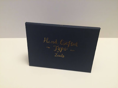
Cover Design:
Inspired sign painted type which I created by using a brush pen and
foiling it gold to give both an aged and authentic feel to the design.

My book is purely photographic to stimulate the reader by it being mainly
image based it appeals to a younger audience as many students are
indated with large amounts of copius text they are more likely to
engage better with an image based content, to also add information
to my book I created a index and map for those interested in more about
the historic nature of the type by having this separate it gives the reader
the option wether or not to read it. My content is printed on a textured
paper with pulp engrained this was inspired by my experiments with paper
although I would of liked to of used G.F.Smiths' Gmund Bier Wizen
stock as a student it was more logistical to use a cheaper stock if to be
recreated commercially I would use that paper because of the textures
and effect it has on the printed images (seen in my example). By using
the paper commercially the price would reduce due to a high amount of
production.
My book cover is simply printed onto G.F.Smiths Indigo paper I used this
paper because of the contrast between the type on the stock, this makes the
typography stand out clear and compliments the design. Although my stock
is a good colour it is likely to be damaged by things such as water and dirt
due to it being paper the only solution to this is finding a similar coloured
buckram which would prevent damages of this kinda - My cover and book is
a simple bind and would by reasonable to be printed a commercial printer
after asking my manager at work how much a short run would cost, it is
unlikely they would print this book because of the bespoke quality my book
would need to printd somewhere dedicated to publication print such as
precision but this could increase the price but in turn the quality.

Overall I am proud of the outcome of my book there are small adjustments
I would make as noted if my budget was bigger etc but the overall finish of
my book is professional - this book could be easily reproduced at a printers
but at a small fortune due to finishes and run.

I enjoyed this brief because I experimented with different techniques such
as binds and foiling, because of this I would like to use these in upcoming
briefs in the future.


Wednesday, 18 November 2015

OUGD504 Brief 4 - Mumford & Sons

I have chosen to design for Mumford & Sons as I wanted
design for someone I will enjoy both design wise and musically.


Meet the band.


Marcus Mumford

Marcus is the lead singer in the band alongside guitarist he also plays
other instruments such as the mandolin! the band is experimental in its
instruments. Marcus was born in California but to brittish parents holding
dual nationality explaining his post war brittish dress sense. Not only a
member in the band Mumford is also a producer.

Winston Marshall

Winston is also a guitarist but well known for playing the banjo!
Before joining mumford and sons Marshall ran a music night at the
Bosun's Locker, a music club on King's Road in Fulham.

Ben Lovett

Ben was one of the founding members starting up mumford and sons
Ben studied with Marcus which lead to the great band they are now.
In the band he primarily plays the piano and keyboard but also guitar
and drums. Alongside Marcus, Lovett is also a music producer and is
well known for producing Ellie Gouldings song 'Lights'.

Ted Dwane

Ted not only part of the band is a keen photographer having built his
own website and portfolio. http://www.teddwane.com. Teds main part
in the band is bassist.

Genre: Rock/Folk Rock/Folk

Best Selling Singles: 
Little Lion Man
I will wait
Babel

How long have they been here: Mumford & Sons came about in 2007
in London.

Current Albums:

Their first album was released in 2009 which was Sigh No More


Most Recent album I will be producing my work for: Wilder Mind


This album is considerably different to some of their other hit songs
it seems the band has had a change of tone which could explain the album
art for this album and a logo rebrand. I personally feel their previous logo
represented their character and music better I will try to incorporate this
into the design but try to show their changes as a band.

"Right from the opening bars of Tompkins Square Park, it’s apparent that
those early sessions in New York and London witnessed a change in the 
band’s approach not just to writing and recording, but to texture and 
dynamics, too. There is a minimalist yet panoramic feel to the new album, 
whose sound Marcus describes as “a development, not a departure.” Which 
came about how – by accident, or as a result of a conscious decision? “It 
was a bit of both. Towards the end of the Babel tour, we’d always play new 
songs during soundchecks, and none of them featured the banjo, or a kick-
drum. And demoing that song with Aaron meant that, when we took a break, 
we knew it wasn’t going to involve acoustic instruments. We didn’t say: 
‘No acoustic instruments.’ But I think all of us had this desire to shake it up. 
The songwriting hasn’t changed drastically; it was led by a desire not do the 
same thing. Plus, we fell back in love with drums! It’s as simple as that.”"

This is an inspiring movement in the bands position in music they are 
simply growing into who and what they want to be and slowly revealing
their new identity which explains the logo rebrand.