Primary Research/Inspiration:
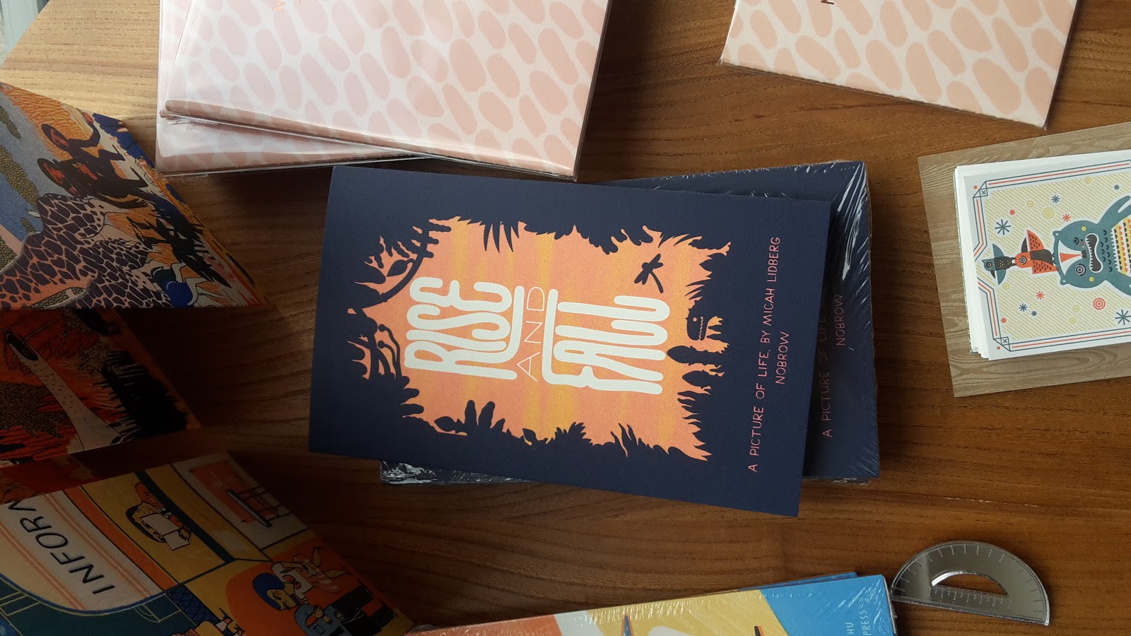
Yesterday I visited several book and creative stores alongside a exhibit
at munro house.
Colours May Vary
While in colours may vary I spotted book that I liked the design and
style of which I could use for inspiration when re-designing the book
cover for studio brief 2.
 |
| 2 Colour separation - This cute book cover design is 2 colours and simple illustrations I like the design but feel the title should be centre aligned. |
 |
| 3 Colour Separation - I love the centred layout and bold text it stands out off the shelf really well. This is from the same series although I prefer this layout. |
 |
| While in colours may vary there was a giant colouring page across the whole wall which you could colour in. This was great fun and interactive with the audience. |
 |
| 2 Colour Separation - I appreciate type and really like the sleek and vivd effect I'd like to do typography for my book cover because of majority amount of the contents being essays on typography. |
Village Bookshop
 |
| 1 colour separation - I like the context of this cover and the link to the title this really stood out to me. It would be good to consider using context when designing for brief 2. |
 |
| 2 Colour separation - I love the bold colours on this book and simplicity, it is iconic and could stand alone. |
Waterstones
I spotted a sign many years ago in leeds and always wanted to take a
closer look so I went down and took some photographs, although
the sign is faded and most definatly aged I think it is beautiful in its
own rights and they typography shows great craftsmanship as I believe
this sign was hand painted. From doing a search on the place it could
be as old as 70 years old but I'm not completely sure on this it
would be really interesting to find more about this sign.


No comments:
Post a Comment