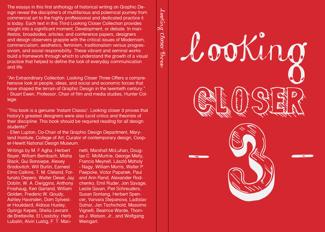
my chosen 4 from asking for feedback it is clear that it is between
the red and white cover or the yellow and blue three. I've developed
these into book jackets to see which is most successful in book form.
 |
| This was one of the first formats I developed its too cluttered and uneasy on the eye the placement and aligning of text is poor the use of colour is also not so good its hard to read etc. |
 |
| I changed the format to make it more legible although it still feels over complicated and defiantly could do with improvement, I think I will scrap the coloured type as it is too hard to read. |
 |
| I tried the first initial format of type on the red cover although it looks a lot more efficient it is still too much. The colours are really punchy and clear to see and read. |
 |
| Similar response to the above.. |
 |
| Ive tried to experiment with adding extras such as the publishing logo and barcode, Although I think it is needed the colours do not fit my design and become almost garish. I'd like to try possibly merging the colours with my design e.g. blue |


No comments:
Post a Comment