Saturday, 28 February 2015

OUGD406 Brief 2 - Typesetting

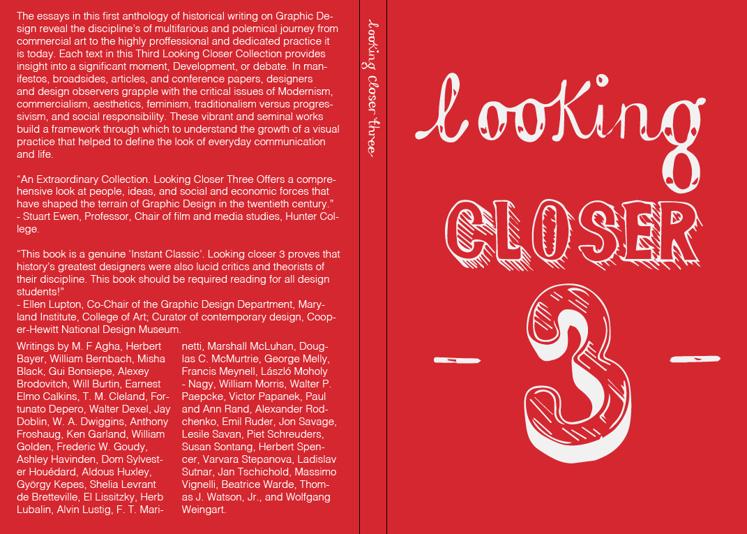
Typesetting and alignment - to improve my blurb I have tried to
eradicate the rag I have also left aligned my text and used 2 
columns.


I've also done something similar here but I have only used one of
the 2 columns, I think I personally prefer the aesthetics of the use of
two columns it fills the book jacket out it also looks modern and
clean.


OUGD406 - Brief 2 - Further Developments

After asking for feedback it was suggested I choose a simple layout not to
complicated and move the editors from the spine to avoid over-crowding
I still need to work on the rag of my text as it is very variated. I just need
now to apply the barcode and publishing press logo I have done the same
for both this design and the red & white.
A lot of people commented that they liked the colour choice of stock I will
do my best when printing digitally to find a similar shade to it. - This applies
to the red cover too, depending which I decide to use for submission.


Thursday, 26 February 2015

OUGD406 Brief 2 - Book Jacket

In total honesty I am unclear which design to take forward out of
my chosen 4 from asking for feedback it is clear that it is between
the red and white cover or the yellow and blue three. I've developed
these into book jackets to see which is most successful in book form.

This was one of the first formats I developed its too cluttered and uneasy on
the eye the placement and aligning of text is poor the use of colour is also not
so good its hard to read etc.

I changed the format to make it more legible although it still feels over
complicated and defiantly could do with improvement, I think I will scrap the
coloured type as it is too hard to read.

I tried the first initial format of type on the red cover although it looks a lot more
efficient it is still too much. The colours are really punchy and clear to see and
read.

This format appears clearer and much more legible I still feel it could be broken
down further to make it easier on the eye I also feel having the authors on the
spine may be too much and should consider placing it elsewhere.


To improve the type alignment I have spaced each paragraph into their own column
this is defiantly much clearer I feel I need to experiment with font size and extras
such as the publishing logo and scanning code.
Similar response to the above..

Ive tried to experiment with adding extras such as the publishing logo and
barcode, Although I think it is needed the colours do not fit my design and
become almost garish. I'd like to try possibly merging the colours with my
design e.g. blue 

Tuesday, 24 February 2015

OUGD406 Brief 2 - Chosen 4

Out of my designs these were the clear favourites from both peers
and my own opinion.


Monday, 23 February 2015

OUGD406 Brief 2 Further Developments

Although I liked my designs, from my feedback I felt I needed 
to refine my ideas to show a clear concept I feel my developments 
are now more finalised and I just need to make small adjustments
etc. 

I asked my peers which they preferred out of the designs informally
to see if I can make a decision and forth improvements.


Hattie Windley I really like the use of the red background and white text for me it 
is the clearest design and the most eye catching 

Emily Kaye At first i didn't get why you'd hand drawn it but now it's kind of cool -
 like it looks like a typical font... but if you 'look closer' theres more too it. For this 
reason I like the yellow and blue 3

Rya Nicholson I like these ones best (3's) either the red or orange one.. maybe
 try the red one with a lower opacity!

Saturday, 21 February 2015

OUGD406 Brief 2 - Feedback

From the crit with the 2nd years it was interesting to get a
variation of opinions and criticism, I showed my ideas and
designs to the group and I didn't get a solid direction to take
the cover there was some clear designs that were inappropriate
for the book such as the eyes etc this is way too childish and
the book is defiantly not aimed at children, One of the second
years really favoured my solid digital three with another
overlapping three he suggested layering different variations of
typeface to get a explosion of colour and variation, he preferred
the digital version to the hand drawn but I disagree and feel the hand
drawn adds more character and has reference to the beginning of
typography which is relevant to the context of the book to compromise
I could try combining the two. I am going to choose 4
designs and work on them to pick out of informally in another
crit then work on my book jackets.

Thursday, 19 February 2015

OUGD406 Brief 2 - Developments

I nextly tried to use my initial sketches and ideas and produce them
digitally to see if they had a similar, greater, better or worse effect. 
I feel some are more successful than others the hand rendered type
 I tried to recreate using a drawing tablet just doesnt have a great effect 
it looks sloppy and less intricate I think if i wanted to use this I would 
need to use the non digital version. I admittedly really like my digital 
displays of overlapping text with the burn tool to give an example of 
how it would actually screen printed this is clever because by mixing
the colours together there is effectively 3 colours and my book is number 
3 in the series.


OUGD406 Brief 2 - Initial Ideas & Development

Ideas, Development and Refinements

I was greatly inspired by Jessica Hische and David smith I took
elements of their work and tried to incorporate this into my own 
designs, I particularly took the hand rendered approach to the ideas 
I felt this was my niche and was relevant to the set brief and my 
books content, I have explored different idea’s - such ideas that 
could be produced digitally if necessary meaning they were versatile.


OUGD406 Brief 2 - Primary Research


Primary Research/Inspiration:

Yesterday I visited several book and creative stores alongside a exhibit
at munro house.

Colours May Vary
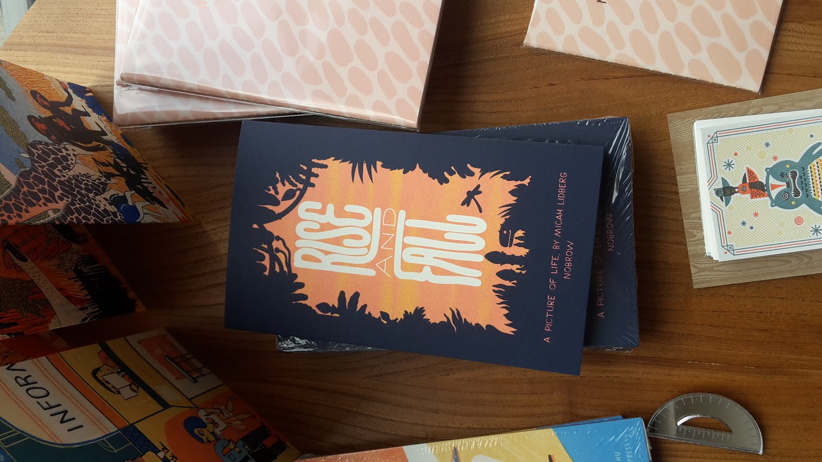
While in colours may vary I spotted book that I liked the design and
style of which I could use for inspiration when re-designing the book
cover for studio brief 2.


2 Colour separation - This cute book cover design is 2 colours and simple
illustrations I like the design but feel the title should be centre aligned.

3 Colour Separation - I love the centred layout and bold text it stands out off
the shelf really well. This is from the same series although I prefer this layout.

While in colours may vary there was a giant colouring page across the whole
wall which you could colour in. This was great fun and interactive with the
audience.

2 Colour Separation - I appreciate type and really like the sleek and vivd effect
I'd like to do typography for my book cover because of majority amount of
the contents being essays on typography.


Village Bookshop


1 colour separation - I like the context of this cover and the link to the title this
really stood out to me. It would be good to consider using context when
designing for brief 2.

2 Colour separation - I love the bold colours on this book and simplicity,
it is iconic and could stand alone.

Illustrative cover - 1 Colour separation - I think the main reason I chose to
take a picture of these illustrative books was the amount of detail it would
be awesome to see such covers screen printed in this nature.


Waterstones


This book caught my instantly I really love the artwork on the front as well
as the beautiful type which I'm aware that Jessica Hische made
specifically for the movie.


I looked at a lot of typography inspired books to see what I could do for my
book cover.


Handpainted Sign - Sydney Green Limited
I spotted a sign many years ago in leeds and always wanted to take a
closer look so I went down and took some photographs, although
the sign is faded and most definatly aged I think it is beautiful in its
own rights and they typography shows great craftsmanship as I believe
this sign was hand painted. From doing a search on the place it could
be as old as 70 years old but I'm not completely sure on this it
would be really interesting to find more about this sign.