Page layouts - Ideas and developments
There are so many ways I could design and arrange my layout,
I have looked at current publications and book design to inspire
me with my grid and layout.
Not only is there different ways of layouts there is a possibility of
using a variety of stock, the restrictions are A4 or A5 paper alongside the
a maximum of 400gsm (weight/Thickness) anything above that and the printer
cannot process it, I will also need a 3mm bleed and a 3mm centre
margin for the bind to work. If I wish to have a full bleed this would
mean stapling the booklet seperatley. I found this out by asking James
in the print resources.
These are some of my inspirations I found these through pinterest.
 |
| This is a menu for Fade St Social in Dublin http://www.fadestreetsocial.com I love the design of this menu purely for its interactive features The spin wheel and flap inserts appeal to me I like tactile design this is clever for a food menu "hands on" if I was to use this as inspiration I could take the flap idea by doing questions and answers with the flaps. |
These are few of my idea developments for my book design and layout.
From my developments I have concluded a specification and restriction
for my book, I am going to use A5 stock this is because I would like to
collate my research into a small pocket guide of train travel if I were to
use a bigger stock it wouldn't be pocket sized, to keep my book
uncluttered and legible I will use 2 columns.
Feedback from the interim crit (on my ideas) suggests that my peers
like the interactive design of half a page. It was suggested when considering
colour scheme I should use the colours acscoisiated with train travel
e.g. Orange and Antique white especially orange on the front cover. I
should look at different stocks and designs used on travel such as
the health and safety on planes 'sheet'. Another useful comment was as
I have decided to target commuters being able to place my book in the
backs of seats on trains would be a clever way of placing if it was to
be printed on a wide scale.
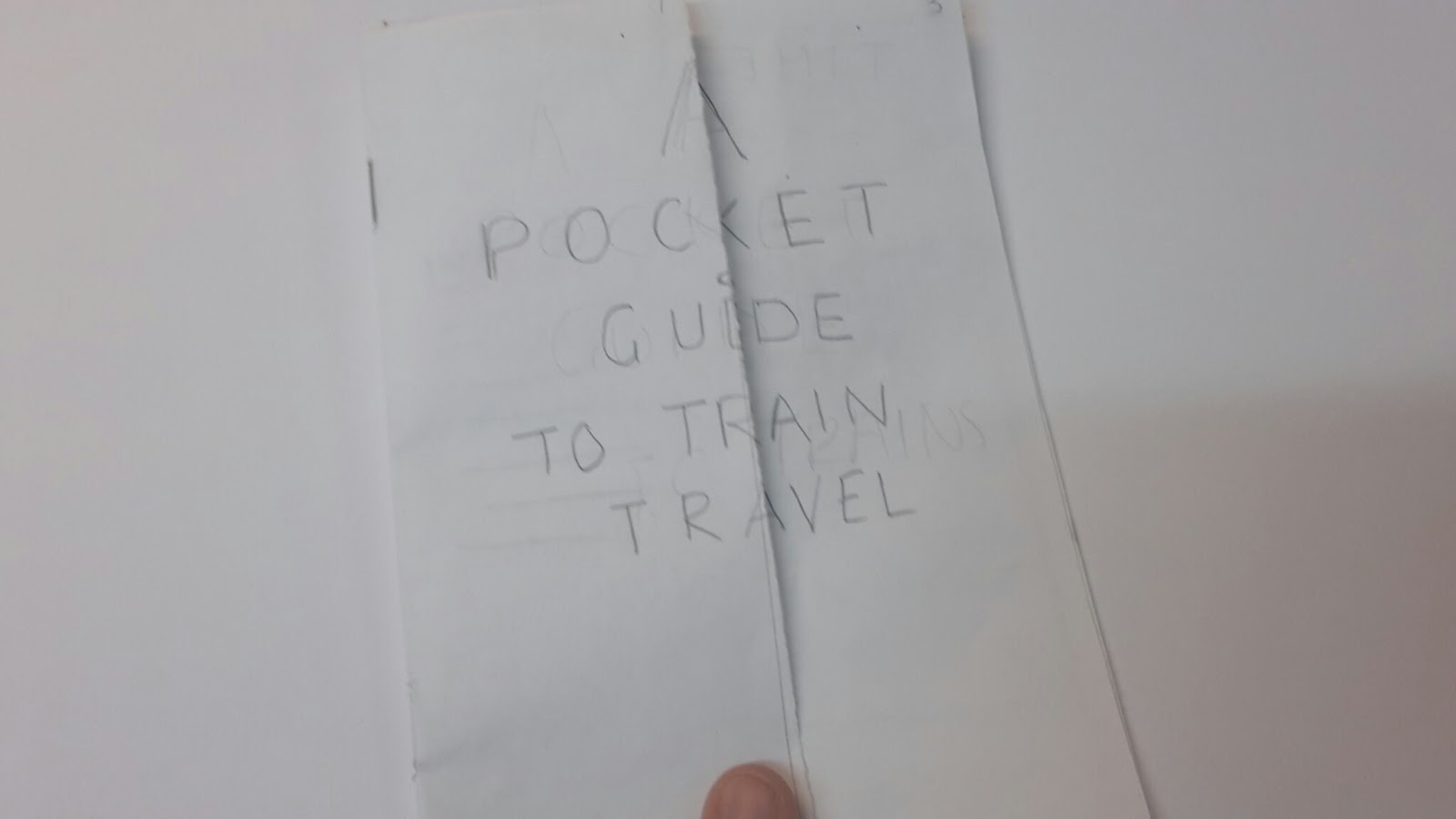
From my Ideas I have chosen to go with the half page front cover design
this can mean I can strategically place my introduction behind the hidden
flap.
To make a decision on order I created a mock up and asked for feedback
- The front cover is original and ambitious you will need to be careful when
lining this up.
- The timetable as a contents is a great way to get commuters to engage with
the book as well as the travel quote on the next page.
- On some pages it would be nice to see a scrap book type style to keep it
informal and fun.
Order:
PG1 Front cover - A pocket guide to train travel
PG2/3 - Blank
- Introduction and half cover title
PG4/5 -Contents page - In context of a timetable
- Brief anecdote of travel - Please have your tickets ready for inspection…
PG6/18 - Content
PG19 - Acknowledgements
PG20 - Blank
Important print restrictions of the Book Bind Printer
Margins 3mm (minimum)
Bleed 3mm (minimum)
400gsm (maximum)
If I wish to do a full bleed it must be bound by hand.
I will need 3 A2 of antique white sheets and and one sheet of orange
to print my book.


No comments:
Post a Comment