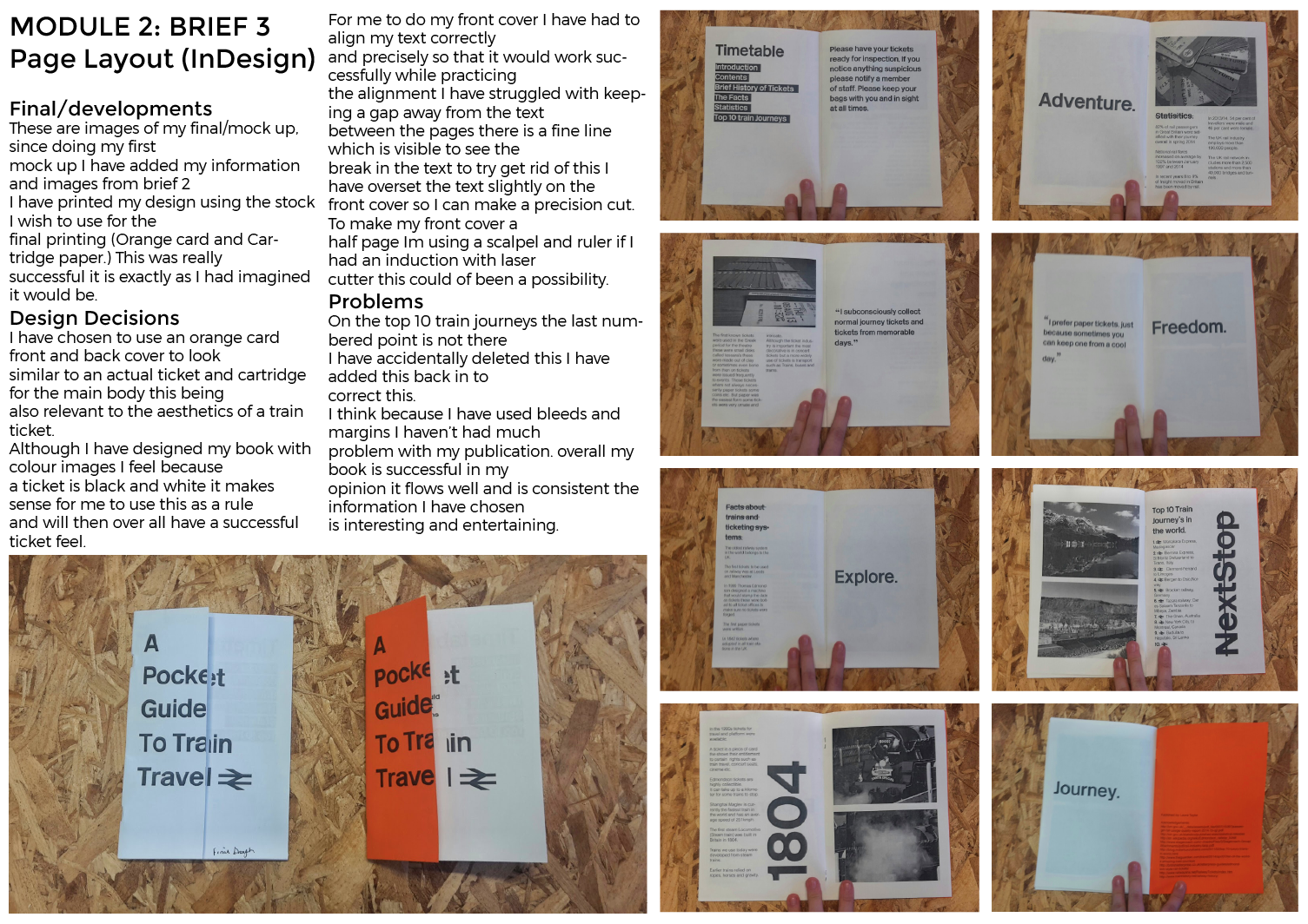
|
| Tickets page, Ive used orange to create my tickets this is because of the similarity to the original paper tickets, I've included all the information from a normal paper tick including a QR code which can be scanned by ticket officers. Iv also added an extra bit to the tickets - A code which can be used if you phone is low on battery - STICKER/TICKET CODE - |

 |
| Ive added a info button |

 |
| Menu idea - This is clear and concise but too plain and boring although its simple I would argue no one would want to use it due to its aesthetics to improve this I am going to create more personalised icons. |

 |
| Menu page 2nd start I have drawn and scanned in images for my icon buttons to make it more user friendly it is also a similar feel to the train line adverts. |

 |
| I felt the icons where powerful and stand alone but could do with some colour to make the feel less white washed. I chose blue and orange because they are complimentary colours although I don't think this works. I plan to remove the colour from the background. |