Brief : To research into given story, make design decisions,
plan the layout composition, colour and typography.
Some websites relating to our story :
To start off we as a group created a basic mind map to help
us choose the direction to take our story.
We decided to use the metro newspaper as our basis, we wanted
to do something different then a newspaper story so we looked
into app design.
It was clear there was only a small amount of columns used
it varied from 2-4 colums on phone apps for the metro this is
because with the text being smaller it needs to be bigger and
easier to read so less columns means less text overall.
We started by designing a simple grid...
...and then designs that we could possibly use to make it appear
app like for example, scroll bars and tabs. (shown top right)
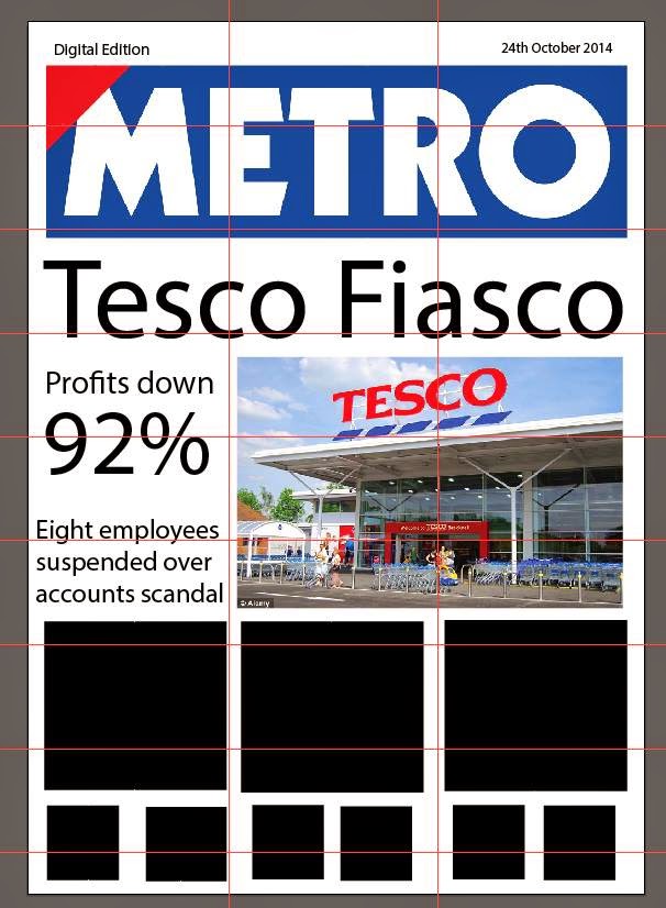
We then took this to the computer our initial composition is shown
on the left this I feel didn't work so well the type did not speak
out or express the story in any way the layout was over complex
for an app and could do with being simplified further, I feel our
design in the end didn't work it progressed better then our original
concept but wholly it wasn't simple enough and could not work as
an app, I feel it would of worked better if there had been much less
text, And rather than having small boxes for other articles just having
a scroll bar to see where you are in the article and having a further
page with a choice of articles like my idea earlier on. I feel we worked
well in a group and could of improved on this as our ideas where
there just not correctly formatted.


No comments:
Post a Comment