These are some of the examples of the process involved when designing my process, my original designs, were garish and over complicated - I have not only explore just this idea but my other ideas such as creating digital posters, and animations.
I have explored using colours such as teal and oranges, I chose to explore with these colour because they appear more gender neutral because my campaign is to be for both genders my poster needs to deliberate from either gender. This is incredibly hard to do.
In my developments I have explored stock choices, interactivity and colour connection - all of these combined are the key to creating both a visually appealing post but a eye catching one too.
In the process I continually asked for feedback both from peers and friends/family this was so I could get a fresh eye.
When developing my posters further I explored layering, this appeared to be successful as a friend on first glance was shocked with what was written - he mentioned that I should try using the spacing between text to overlap - so that both quotes are visible.
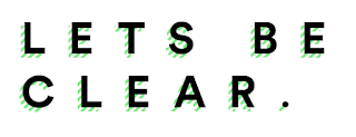
My logo deriving from my concept, needed to be clear and straight forward but also stand out across my campaign to do this I decided that a logotype would be the best solution for this task.
I explored with typesetting, Line width, depth, colour and shadowing. The best feedback was from the one off shadowing it was said that this stood out from the rest but didn't over complicate - this design meant it wouldn't take away from the overall information.


No comments:
Post a Comment